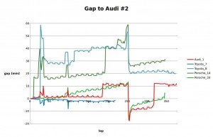
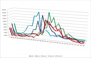
This graph shows the gaps between the winning Audi #2 and the other factory LMP1 cars.
How to read this?
Negative values mean the car is infront of the Audi #2, positive they are behind.
The little ripple come from pitstopps.
What we can see is, that the Toyota #7 was in the lead all the time (as we know) until it broke down, but because the line is relativly flat, both car did very similar laptimes. A reason could be that the Toyota took it easy or both cars were very equal.
The Porsche #20 tells a different story. Over the laps the graphs is rising, because the Audi #2 was constantly faster until around lap 250, when the turbo of the #2 had to be changed, and the Audi #1 and the Porsche #20 entered P1 and P2.
Before the 2014 race, ACO and FIA installd the Slow Zones to reduce the safety car problems where others can be penalized just because the safety car came out at the wrong time. Unfortunatly the safety cars came out this year again and again some had a big gap of a few minutes. Which can easily be seen at around lap 25. There has to be something for the future!
